
|
|
|||||||
| Home | Forum | Registrarse | Mini-Banners  |
Miembros | Calendario |
| Fotografía Artística ¿Te dedicas a la fotografía? ¡Comparte tus técnicas y trabajos aquí! |
|
|

|
 |
 Este thread fue creado hace 5528 días. Lo mas probable es que el tema ya se haya resuelto y no necesite más discusión. Aunque si todavía crees que es necesario agregar un comentario, puedes hacerlo. Este thread fue creado hace 5528 días. Lo mas probable es que el tema ya se haya resuelto y no necesite más discusión. Aunque si todavía crees que es necesario agregar un comentario, puedes hacerlo.
|
|
|
Herramientas |
|
|
#1 |
|
ಠ_ಠ
Fecha de Ingreso: 06-June-2006
Ubicación: Rohrbach, Bern
190E, Galant, 460, e21
Tiempo: 9.90
Mensajes: 12.831
Feedback Score: 47 reviews
|
Composicion
Este es un tema bastante extenso y esta en ingles, pero no creo que tengan problema con eso, saber dos idiomas les puede abrir muchas puertas  pero eso es harina de otro costal asdfasfdasfdasfdasfd pero eso es harina de otro costal asdfasfdasfdasfdasfdMucho mas importante que cualquier camara que tengamos, es nuestra creatividad para componer una foto, de nada sirve tener la mejor camara del mundo si no sabemos a que tomarle. Este es el tema mas importante de todos!!! Todo esto es cortesia de KenRockwell.com, es una excelente pagina donde he aprendido mucho y si quieren donar el link es este http://www.kenrockwell.com/donate.htm 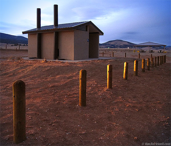 Toilet, New Mexico. (Canon SD880) What is Composition? Composition is the pleasant arrangement of elements within a frame which give the most powerful ability to attract the eye, and to keep it exploring within the frame for as long as possible. Edward Weston said it best: "Composition is the strongest way of seeing." In a nutshell, composition is all about Simplification and EXclusion (SEX), then balancing what you've got. Repeat this until you get the strongest, simplest possible image. You can never get too much SEX in photography. Force yourself to think about SEX all the time and keep balancing what you get, and you'll be a much better photographer. Keep striving for simpler and simpler: it results in a stronger and stronger image. A wimpy image (one with a lot of random stuff in it) is a poor image. The strong image that says "Pick Me!" is the simplest and best balanced possible image. You ultimately shouldn't have to analyze or think about this as you shoot. You should just feel this process subconsciously and apply it automatically. Keep thinking about SEX all day: Simplify and EXclude; then balance what's left. You need to organize the stuff within your image so it makes sense to every viewer who wasn't there with you at the scene, otherwise your photos will stink. To make a good photo, its composition needs to speak most strongly to our subconscious. It's not about the details or the subject. It's what your subconscious pulls out of it all without thinking. Composition is all about getting the basic, underlying structure of an image to appeal on the most elemental level to our subconscious mind. This is what generates the "Wow!" factor which catches our attention. We do by making sure that the biggest, broadest elements are arranged properly and by keeping everything as simple and direct as possible. The more we include, the weaker the image becomes. The less we include, the stronger it becomes. When I compose, I'm not looking at the subject or details. I'm trying to defocus my eye and attention so that I only see basic forms and shapes, and then move these around to make the strongest possible statement. In the toilet photo above, the sky isn't a a sky. The sky is used as a big, blue shape. The toilet isn't a toilet: it's a dark blob that balances against the row of pylons. The row of pylons isn't a row of pylons: it's a swash that guides our eye from the bottom left up and into the photo. The car headlights lighting up the middle of the row of pylons isn't a car headlight: it's a visual trick that draws our eyes to the middle of the image and keeps them coming back as we explore the image. The picnic table cover on the right isn't a picnic table cover: it's the smallest in a series of three progressively smaller triangles which includes the roof of the toilet, the mountain, and then the picnic table cover. When I made this shot, just like every shot, I didn't think about any of these details. All I was thinking about was SEX and balance. SEX means Simplify and EXclude. SEX means be sure to keep getting closer to simplify the image and exclude any irrelevant junk on the edges and corners of the image. Balance means that after you've simplified the image as much as possible by getting closer and excluding as much as possible, that you move your camera around to make everything balanced in the frame. I framed and fired this shot without concious thought as others were getting out of a van and headed for it I had almost no time to think even if I wanted to. Photographers usually get it all wrong. Composition is all about the broad, underlying and most basic organization of the larger elements in your scene. Composition is not about details or texture. A strong photo is not about the subject matter. What draws us into a good image are the basic shapes, contrasts and colors that catch our eyes. Definitions and your Girlfriend Framing is how you drop the photo's edges onto your composition. It's controlled by where you point your camera and your lens' focal length. Perspective is the location of your camera. Perspective is defined by where you stand and at what height you hold your camera. Perspective doesn't change as you zoom. Perspective only changes as you walk around and raise and lower your camera. Tripod users cripple themselves because all too often they shoot every picture at the same height, which is rarely the best height. Composition is when your girlfriend comes over and straightens up all your magazines, cameras, half disassembled motorcycle engines, shoes, books, dirty socks and sporting goods that you left all over the house. All this junk makes perfect sense to you or me, but it makes no sense to the woman or anyone else who comes over. You or I know exactly why and where everything is, but it makes no sense to anyone else. The woman needs to organize it so she can understand it and so it looks pretty to her. This is composition, and most men hate it. I know I sure do. That's why our photos usually suck. Like a dirty room, your photos always make sense to you, but they won't make sense to anyone else unless you clean them up first. A photo needs to make sense instantly to anyone who looks at it. No one is going to try to figure out your photo any more than anyone would try to figure out why you've got dirty shirts thrown in three random piles. No one cares about your piles, and no one will care about your photos unless you expend conscious effort to tidy them up. All too many hobbyists worry about every technical and equipment issue, but never bother organizing what's in their photos as they snap them. Camera catalogs, just like furniture stores, like to lull you into thinking that all you have to do is buy the camera (or furniture), and everything will magically clean itself up for you. Most people set up in the most convenient spot and shoot away. We'll zoom in and out and look left and right, but that's it. We figure we always can fine-tune things later in Photoshop or Lightroom, or give up completely and just make an HDR. Just like our living rooms, we know we can clean them up later. NO ! ! ! ! ! ! ! You can clean up your bedroom next week, but you can't fix composition after the shutter closes. Photoshop can make things lighter or darker or crop out junk on the sides, but it's a real bear to try to move objects around within a frame. You can move objects if you extract them and put them into separate layers, but you never can move shadows or light sources unless you start redrawing pixel-by-pixel. Guess what? I've worked in Hollywood where we do these things to images in post production every day, but the only way we can move light sources is by reshooting, or by re-rendering CG (computer-generated elements) after we've updated the coefficients that describe the light sources. The only way to ensure strong composition is to look through your finder and make it that way before you press the shutter. Move yourself around to change perspective, which moves elements around in your frame. You can change the relative sizes of elements by moving in and zooming out to maintain the same framing. When you do, closer elements just got bigger while distant ones just got smaller. This is the real reason to use zooms: because you have precise control over the relative sizes of objects so you can create perfect balance. Move the objects around yourself if you can. Have your model move here or there, push the props around, and have people do what you need them to, because it's usually impossible to change it later. Composition is just like arranging stuff in your house. Some people have a knack for it, like women, while we men usually just make it practical. Some people have a natural talent to make things look right, while most people don't. I know I sure don't; before I was married, my place was a dump. I have to work really hard to make my photos work. It has everything to do with deliberate composition, and nothing to do with luck or equipment. Photographic composition is just like interior design. Each places elements in a space: the designer arranges your room, while you have to design the elements in your frame. Does this require practice and careful study? Yes! Some people just have the knack, while most people don't. Painters need to dream all this up in their heads. Painting is tough. Photographers have it easy: we can move around and hopefully recognize when things look right in our finders. If you shoot by pointing your camera and zooming in and out, that's why your photos are dull, regardless of how expensive your camera gear. Your photos are probably as messy as was your dorm room. Just like the stuff in your house, a photo only looks good to other people when you've gone through the conscious process of arranging (composing) everything to make the clearest, strongest statement that you can. Your photo can't be like a messy room. A good photo has everything arranged perfectly so that when someone sees it for the first time, everything is obvious and there are no distracting elements. I hate it when strangers send me crappy, carelessly composed photos and ask me "are these any good?" The key word is careless: the shooter never paid any attention before he shot. No one cares if they're sharp and well exposed (every camera does that automatically today); what's important is what effort you put into composing the picture. I always find something nice to say because that's the way I am, even though I'm usually thinking "What a careless idiot. Why would he think anyone else cares about this photo if he didn't care about it when he snapped it in the first place? What is this photo supposed to mean? What am I, a mind reader?" For the particularly dense, when I say I'm not a mind reader, I mean that of course I know you've sent me a snapshot of a cat or a kid or a sunset. So? Why should I care? When I say "what does it mean," I mean does it show glee? Elation? Does it make me laugh? Does it make me soil my own pants over how beautiful it is? What makes the photo stand out or make it beautiful? Is there a funny gesture? Does the cat have a $500 bill in its mouth? Are you showing me a unique point of view I haven't seen before? Is there a punchline (funny ending) someplace? Ask yourself: what about the photo makes it worthwhile for anyone else to spend the time examining? If there isn't anything, then it's just another crappy snapshot. Digital will do this to people; that's why there's a delete button. Use it. Good photos reward viewers. Crappy photos without rewards waste people's time. If you shoot and don't really know why, your photos probably fall into this class. As Galen Rowell observed, careless shooters will usually come up with an OK shot every so often by pure luck, but the only way to create consistently good work is to pay attention. Pay attention to what? That's why you go to art school, and why most of the world's best photographers have arts degrees, like Cartier-Bresson, Jay Maisel, Ansel Adams, and the list goes on and on. The best class you can take to improve your photography is to take a local adult-ed or community college class in drawing, painting or composition. It's often free, or might cost as much as a whopping $80. In a nutshell, composition is all about balance. It's all about balance between light and dark, warm and cool, big and small, rhythm, pattern, line, curves, impact, negative space, texture and a lot more. Composition also deals with how a viewer's eye enters and explores the image. Our eyes are first attracted to the lightest or most contrasty areas, and explore out from there. Don't give the eye any lines that lead it out of the image; you never want to break the frame. Darken the edge of the frame if a line might lead an eye out, but remember that lines also can lead eyes in. We Americans read from left to right; other cultures read differently. You want to keep viewer's eyes from wandering out of the picture. Darkening the edges and lightening your intended points of interest help. Pay rapt attention to your composition while shooting. Forget tech while you're shooting. I may obsess about tech all day while writing this website, but when I shoot, I think about nothing technical at all. The only reason to pay any attention to technical issues is so that you've so mastered them that they are unconscious second nature when you're out shooting. All I'm doing when shooting is concentrating on how things layout and balance in my finder. I'm even trying to defocus my eyes so I see the critical underlying fundamentals of the image, without the distracting details. Good composition happens in the subconscious basics that underlie an image. The strong fundamentals of light, dark and color that we see even as a thumbnail image are the most critical things. Sharpness has little to no bearing on composition, and therefore has little to do with the value of an image. Sharpness is a distraction that diverts our attention away from the fundamental elements which are the foundation of a strong image. I'll say that again: the most important parts of every image are the things that are visible even as a tiny thumbnail. These are the overall organization, weight and balance of every image. If you can't get an image to look good as a thumbnail, it's not a strong image. Concentrate on the thumbnail as you compose. Tiny finders aren't much fun, but they help us see the basics better. Big finders are bad because they make it more difficult to see the basics: we see the leaves on the trees instead of the overall composition of an image. Large format cameras have upside-down images, which are great because they further abstract the image from the present reality, and force the photographer to create a composition with strong basics that stand up regardless of the details. Ask any painter: often they'll invert their canvas to see if the composition holds up when the conscious subject matter goes away. Focus on the fundamentals of your composition, not the details of your subject or technology. Be certain that every image makes sense to anyone who sees it, not just to you. Composition is everything in a photo. The basics of color and shape are critical. The actual subject matter is only secondary or tertiary. Art critics tend to categorize me as a toilet photographer, but in fact, my work is all about the colors, shapes and relationships. Toilets just happen to pop into my viewfinder because I usually have to pee after being out shooting, but they aren't the subject: it's their shapes and colors. Example: SEX and Balance Composition is the pleasant and strongest arrangement of elements within a frame. It's easy to say, but difficult to do. When one arrives at a scene, how does one create a good composition, which means a strong, compelling image? How can you make your pictures come out better? Photographic composition is more difficult than composition for painters because the most critical thing in photography, after getting good balance among the elements, is to be able to exclude all the distracting elements. Much better, but very unbalanced. Can you see or feel how everything is in the lower right side of the image? Can you see the black line at the lower left which is doing nothing to help the image? It's a distraction. Our eyes focus on the lower right. Worse, I've cut off the red stuff at the bottom, which annoys a viewer because his eyes are trying to see what's in red, but can because it's cut off. The technique I use is simple. I keep smacking myself saying "Simplify! Simplify! Simplify!" as I get closer and closer. After I think I've made the best possible shot, I try to simplify the image even more, making even stronger images. Composition is making order out of chaos. That sounds swell, but how do we do this in the real word? Let's find some chaos and try it out. Here's a series of photos that might help show how we apply SEX and balance. I walked into a bathroom whose graffiti changes everytime I visit, and I take my first shot: 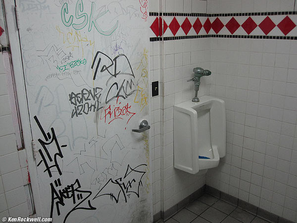 Most people might be happy with this, but it has nothing going for it. It's a mens' room in Oceanside, California, snapped with a Canon SD780 IS at its default settings. First off, it's too dark because the camera saw all the white, thought it was a much brighter scene than it really was, and made it too dark. I set my exposure compensation (the +/- button) to +2/3 for the next shots. Ask yourself: what is it about this scene that attracts our eye? What is it all about? (If you're saying nothing!, humor me and follow along anyway.) Why did I want to take a picture? It's the graffiti, not the whole room as the first shot shows. Forcing myself to simplify, here's a shot that gets closer to what compelled me to take a picture in the first place: the graffiti: 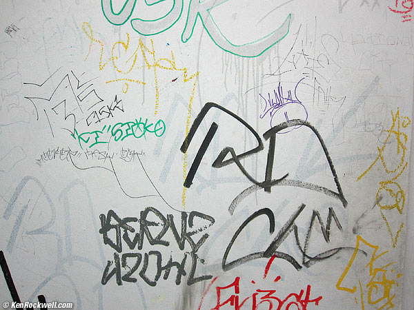 Get closer, simplify and be sure you've got balance. Also be sure not to "break the frame" with any important element being cut off by the edge of the photo:  A balanced composition. We can do better. Let's simplify by getting closer and see what happens. Forcing ourselves to get closer, we get:  Closer, but with a distraction.  A decent composition. The two strongest elements, the red letters at the bottom and then the black letters at the top, are complete and uncut by the frame edges. The items that are cut-off on left and right aren't key elements, so the cut-off isn't distracting. (This is where painters have it easy: they simply don't paint in those elements.) Now we can worry about making a sharp image:  A sharp image. In this case, the added sharpness takes the emphasis off our balanced and clear composition and distracts somewhat by adding texture and showing the scratches in the door. This is a balanced composition, but it's flat. It lacks depth and emphasis. Let's add emphasis to our key elements in the darkroom by lightening (dodging) what's important and darkening (burning-in) what's not:  Burned and dodged for emphasis. I did this with adjustment layer masks in Photoshop, but you can do this selective lighting and darkening in most software, as well as a real darkroom. Want to know what made Ansel Adams who he was? It wasn't his ability as a photographer; it was his ability to print well using burning and dodging. Don't do what I did here, which was to use so much that it looks obvious, especially since I told you about it. Once your use of selective lighting becomes visible, it looses its effect. It's far stronger when it's not obvious that you've done anything to the image, even though you have. Once you are happy with one shot, repeat SEX for more! Here are two other snaps from the same mens' room, all made in the space of a few seconds while I hurried up before anyone else wandered in: 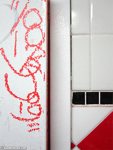 The Pole, in Red, White and Black. 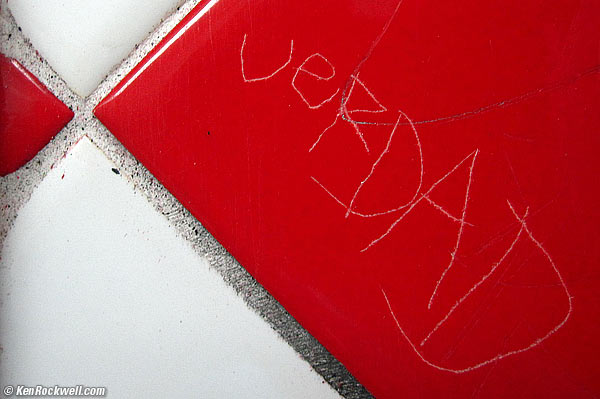 Truth. (I clicked the Macro mode button on the Canon SD780 IS.) With practice, you won't make crappy snapshots anymore. The voice in the back of your head will keep you thinking about SEX (Simplification and EXclusion) and you'll force yourself to get closer and closer and make simpler and therefore stronger images automatically. You'll automatically Simplify, EXclude and balance, and your photos will be a zillion times better. You can do some SEX and balancing in the darkroom and Photoshop. Use your crop tool, and paint out distractions. It's best to do it in-camera (for instance, you can't easily change the relationships between elements elsewhere), but you can do some additional SEX and balance after the shot's made. If I can pull these shots out of a gang-infested mens' room in 60 seconds, you'll be able to do this a hundred times better when you're someplace actually worth photographing and have a whole five minutes. (When the light's good, you don't get more than 5 minutes.) You'll be able to make great photos anywhere with any camera, and know why I keep preaching that your camera doesn't matter. Once you learn and apply basic camera adjustments and proper composition, you'll make great photos with any crummy camera. If you don't learn and apply these, you're doomed to making crummy photos with every camera, regardless of how new or expensive.
__________________
Intel Core i5-6600K @4.5Ghz Cooler Master Hyper 212 EVO Asus Sabertooth Z170 Mark 1 16GB Corsair Vengeance LPX DDR4 @2400 Asus Radeon R9 390 8GB 1100/1600 Samsung 840EVO 120GB Samsung 830 240GB 2 x 640GB Samsung - RAID 1 800GB Western Digital Green SATAII Corsair CX750m Corsair Carbide Air 540 |
|
|

|
|
|
|
#2 |
|
oO
Fecha de Ingreso: 05-June-2006
Ubicación: no se
GTI MKI
Tiempo: slow
Mensajes: 27.714
Feedback Score: 40 reviews
|
Re: Composicion
 |
|
|

|
|
|
#3 |
|
Sideways
Fecha de Ingreso: 12-December-2006
Ubicación: guatemala
BeEme
Tiempo: ..../...
Mensajes: 15.232
Feedback Score: 15 reviews
|
Re: Composicion
vamos a leer

__________________

|
|
|

|
|
|
#4 |
|
moderador clubs
Fecha de Ingreso: 04-June-2006
Ubicación: Guatemala
Mensajes: 39.688
Feedback Score: 35 reviews
|
Re: Composicion
cabal mucha mara incluyendome no tomamos en cuenta que en la foto a veces se cuelan objetos que distraen de lo que en verdad queremos mostrar.
yo eso entendi.
__________________
  |
|
|

|
|
|
#5 |
|
Senior Member
Fecha de Ingreso: 05-June-2006
Mensajes: 5.478
Feedback Score: 14 reviews
|
Re: Composicion
Muy buen tutorial. Lo de la "significancia" de la fotografía es muy importante. En muchas ocasiones tomamos fotos que para nosotros dentro de cierto contexto dado significan algo... pero que para los demas... simplemente no significan nada. Los elementos, y la "universalidad" de los mismos son los que permiten que una fotografía "salte a la vista". Excelente sección, muy buenos tips, y por ahi he visto tambien muy buenas pics!! Gracias a los que motivaron esta sección, y al drowned por ponerla!
|
|
|

|
|
|
#6 |
|
˙
Fecha de Ingreso: 04-November-2006
Mensajes: 16.383
Feedback Score: 111 reviews
|
Re: Composicion
 Excelente vos Blackstare Excelente vos Blackstare  PD: Para los que no saben ingles ni pueden usar google   http://translate.google.com.gt/trans...hl=es&ie=UTF-8  |
|
|

|
|
|
#7 |
|
.........................
Fecha de Ingreso: 24-September-2007
Mensajes: 3.412
Feedback Score: 10 reviews
|
Re: Composicion
gracias, buena onza. Leyendo
 |
|
|

|
|
|
#8 |
|
Sho Mula!!!!
Fecha de Ingreso: 31-July-2007
XJ,:diablo:,VW
Mensajes: 18.931
Feedback Score: 45 reviews
|
Re: Composicion
interesante info
 sigo aprendiendo  haber que tal haber que tal 
__________________
 Para que cambien de opinion!!! Y que no todos somos iguales!!!  
|
|
|

|
|
|
#9 |
|
I Love My Honda!!!
Fecha de Ingreso: 04-June-2006
D17a2
Tiempo: 10+
Mensajes: 10.133
Feedback Score: 14 reviews
|
Re: Composicion
 Voy a leer algo que no me va a servir pero solo por cultura general 
__________________
 
|
|
|

|
|
|
#10 |
|
VIP MEMBER.
Fecha de Ingreso: 17-June-2006
Ubicación: guate
Suzuki
Tiempo: 3 meses jdklf
Mensajes: 1.573
Feedback Score: 9 reviews
|
Re: Composicion
bueno esto creo que es lo mismo que al tomar videos. y pues eso ya me lo enseñaron jajaja. pero es bueno echarle una leidita para que nunca se les olvide.
vs blacks estas en la landivar va? ahi como que vi tu carro varias veces. |
|
|

|
 |
|
|